The Australian Child and Youth Wellbeing Atlas uses maps and graphs to show how children and young people are doing across the country. This process, called visualisation, makes data easier to understand. Even if you’re new to exploring data, the Atlas is designed to be straightforward and easy to use.


How Colour is Used in the Maps
The maps use colour to show how different areas compare in terms of indicators of health and wellbeing. A particular area (such as a local government area) may be higher, lower or close to the national or state average for the chosen indicator. This is represented by the colours that fill areas on the map. In the default colour scale:
How to Read the Colour Scale
This colour scale enables users to immediately identify areas with relatively high, low or equivalent results compared to the national or state average values (this depends on whether the user chooses national or state view in the maps).
Whether a high or low position on the scale is a good wellbeing outcome depends on the indicator.
For example, fewer babies born underweight (less than 2500g) is a desirable result, thus we would hope to see more blue or green filling the map.
Conversely, more children being fully vaccinated is desirable, therefore we would expect to see the maps filled with more orange and red areas.
Blue/green
Lower than the average
Yellow
Close to the average
Orange/pink
Higher than the average
Note that for some indicators, some areas will not be filled with a colour or will be filled with grey stripes. Where an area is not filled with colour, this is because there are no data available for the selected indicator in that area in the selected year and population. Where an area is filled with grey stripes, this is because publishing the data for the selected indicator would pose a privacy risk due to small numbers, and so it must be supressed (see more information about suppression on pages 8-9 of the Technical Document).
data graphics
Visualising Data with Graphs
The Atlas represents results in three ways: scale (colour ramp), distribution chart, and time series graph.


The national or state scale shows the full range of indicator values across Australia (national view) or the selected state (state view) from the lowest values on the left (represented by blue) to highest values on the right (represented by pink) with the average value in the middle (represented by yellow). A black dot on the scale marks the selected area’s position on the scale, with its exact value displayed next to it.
The distribution chart displays the range and frequency of values observed across Australia (national view) or the state (state view). The height of each bar in the chart corresponds to the number of areas with values within a set interval, i.e. a tall bar represents lots of areas with similar scores, while a low bar represents fewer areas with similar scores. The black dot below highlights the chosen area’s value in this range.
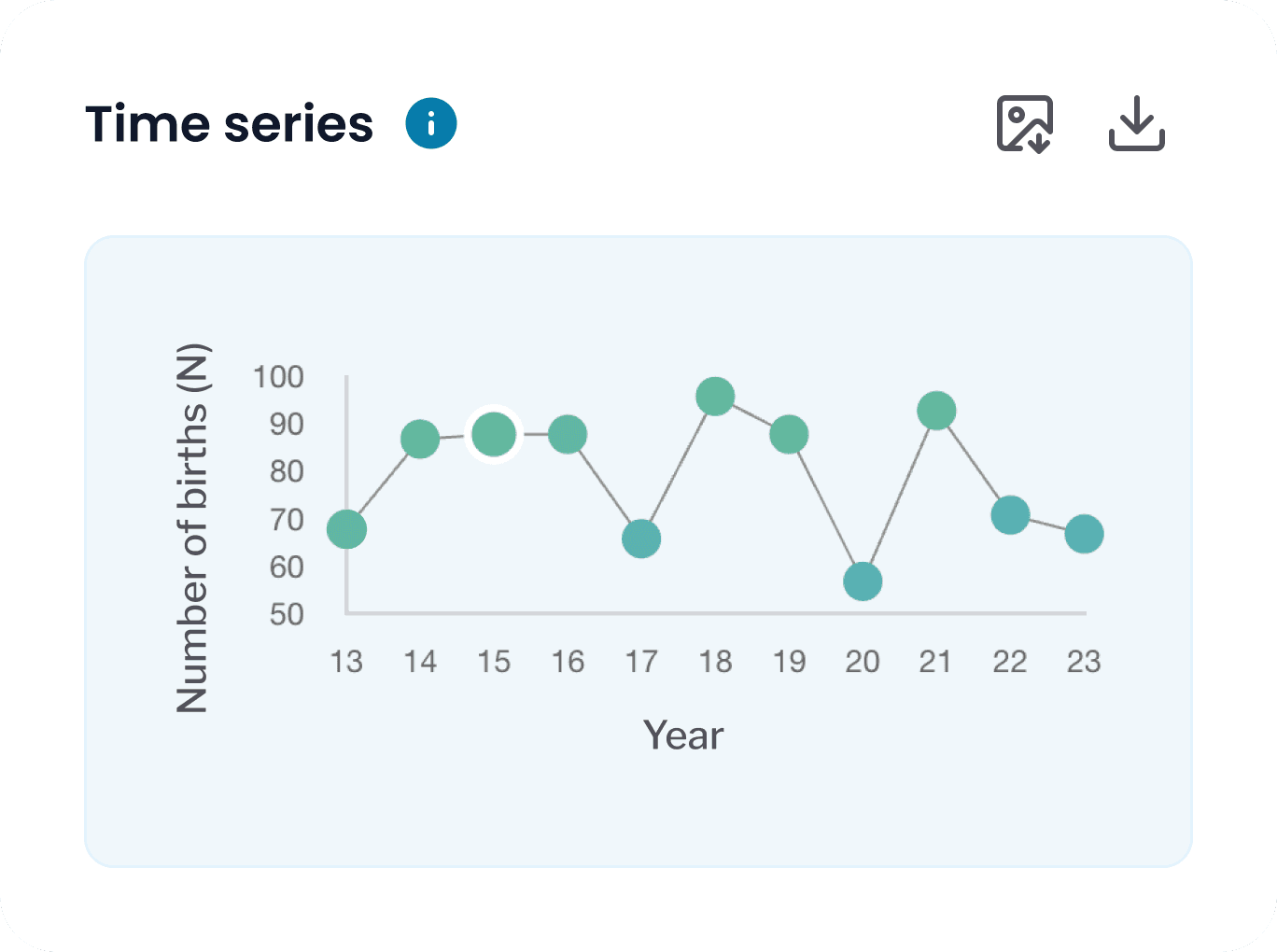
The time series graph tracks indicator values for the selected area across the years for which data is available. Hovering the cursor over any time points in the graph will display the results for that year.
statistical area
How the Maps are Visually Divided
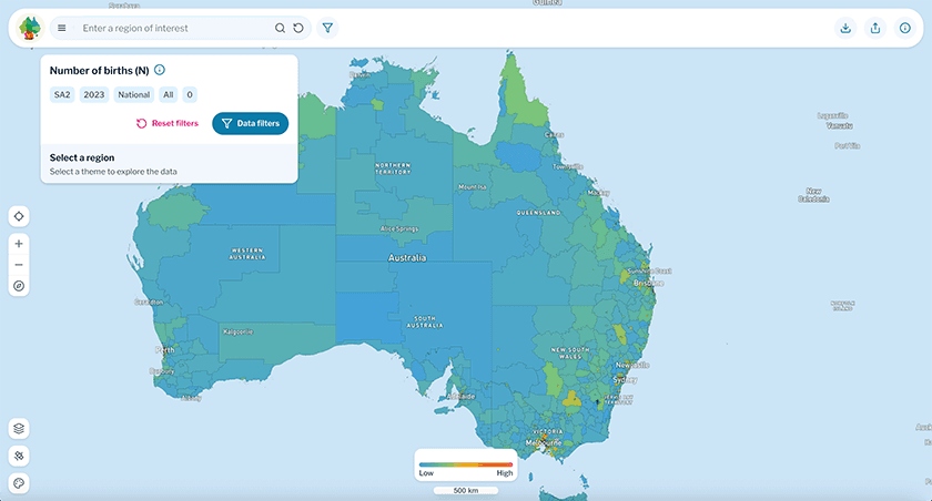
The maps of the Atlas are grouped by statistical areas, which are a way to divide Australia into smaller, standardised regions based on how many people live there. This means that:
Cities have many small statistical areas because lots of people live close together, whereas
Rural places have larger areas because fewer people live there, and are more spread out.
Therefore, large rural areas might look more noticeable on the map, but the graphs provided will help present the full picture. You can zoom in and out, just like on Google Maps, to see more details – especially in crowded city areas where the areas are too small to be readily visible on the full map of Australia. Clicking on an area of interest will display graphs for the area in the panel on the right-most side of the screen.
See more information about statistical areas here. The Atlas maps can also divide Australia into its states and territories for a within state comparison view. In this case, areas that are not within your chosen state or territory will be greyed out on the map.
map visualisation
Using the Maps
The coloured map, viewed alongside the distribution graph of the distribution, provides a picture of Australia that allows users to quickly identify areas of national or state-level priority; or from a local perspective, how an area of interest compares to other regions across indicator of health and wellbeing. The timeseries graph can then provide further visual detail on how the selected indicator has tracked over time in the selected area.


